Laxton Junior School

Design / Art Direction / Content / Animation / Video

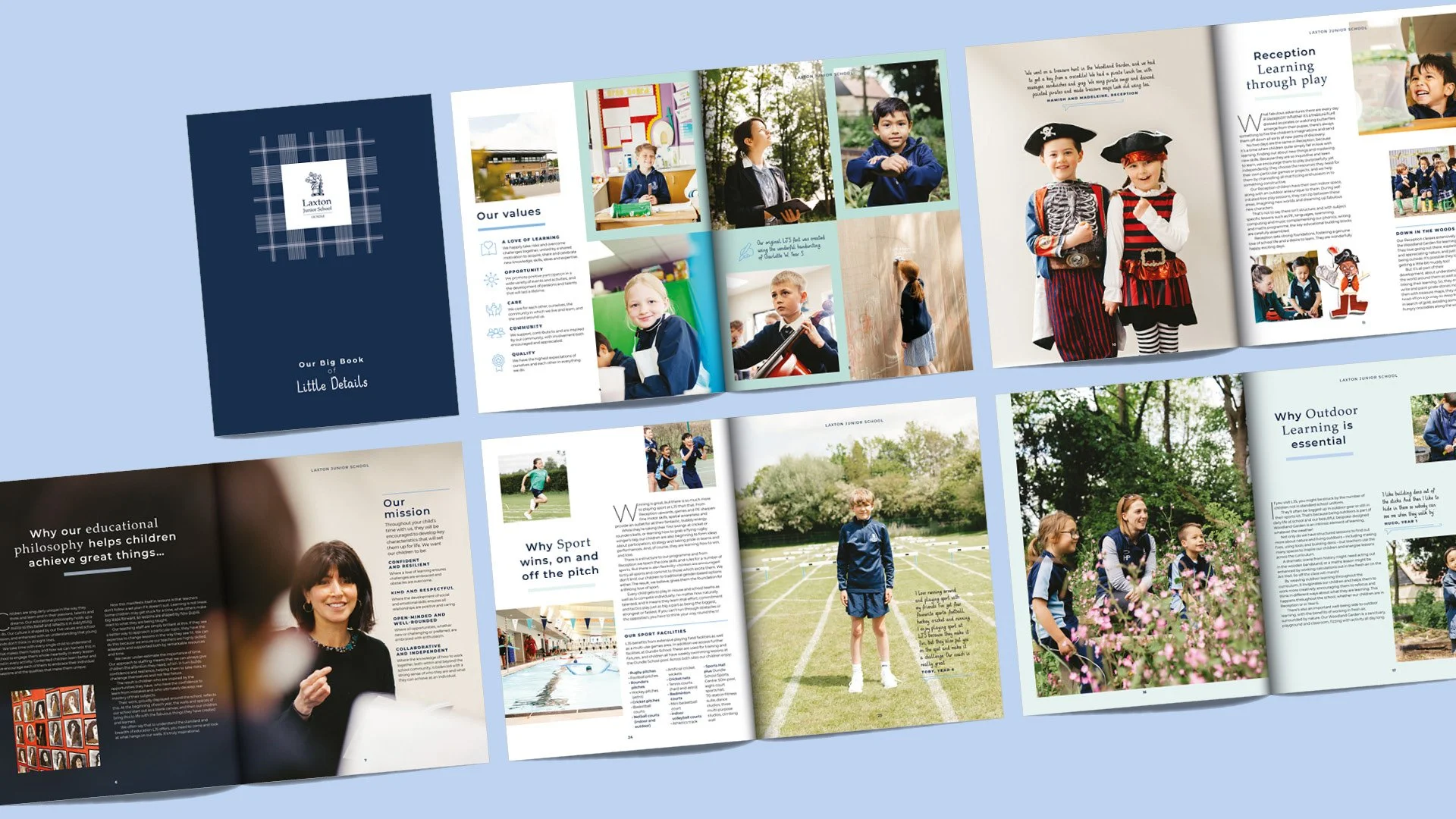
Oundle’s prep school, Laxton, wanted to define the unique way it teaches. We created the branding and creative that brought ‘The Power of Play’ philosophy to life.

As part of the prospectus redesign, the School wanted a ‘friendly’ typeface to be used throughout. We suggested creating a bespoke font, with the School holding a pupil competition for the best handwriting. We then worked with the chosen student to create the typeface.

The Power of Play

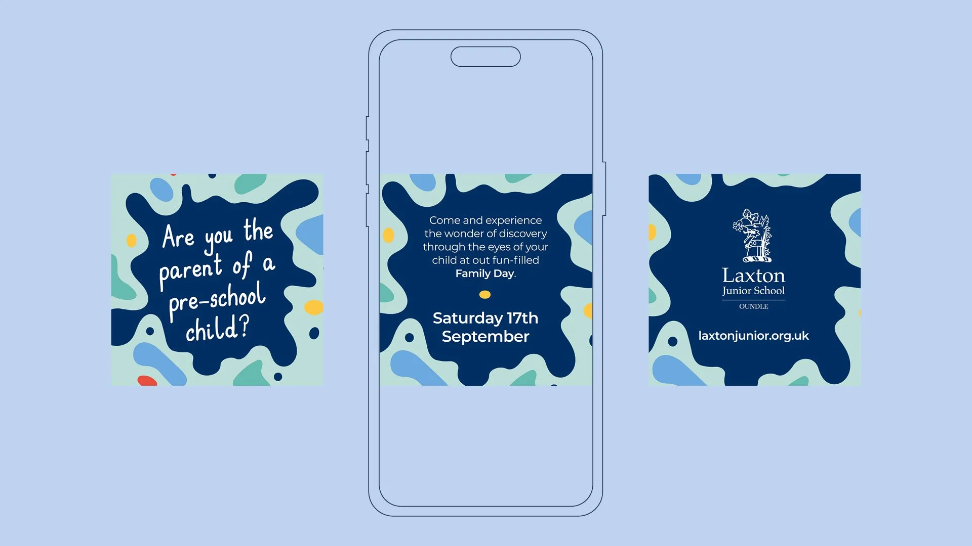
LJS focus on the ‘Power of Play’ in their EYFS facilities and teaching methods, and tasked us with creating a fun brand to help communicate this to parents and public.

We created branding based on organic shapes and bright colours along with the LJS typeface, bringing exciting creative to match the enjoyment of the Early Years pupils.
Previous
Previous

Copthill School

Next
Next

Mina